
Microsoft 365 Blog
Skip featured posts


4 min read
Bringing Copilot to more customers worldwide—across life and work
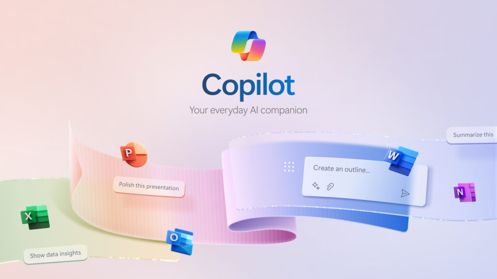
Continuing our vision for Microsoft Copilot to bring the power of generative AI to everyone across work and life, we’re expanding availability and purchase options for individuals and organizations and bringing new value to Copilot Pro subscribers.
6 min read
Introducing Microsoft Copilot for Finance: Transform finance with next-generation AI in Microsoft 365
We’re announcing the public preview of Microsoft Copilot for Finance, a game-changer for finance professionals and the newest role-based extension of Microsoft Copilot. Microsoft Copilot for Finance is a momentous leap forward, specifically crafted to revolutionize the daily grind of well-known financial processes.
5 min read
Expanding Copilot for Microsoft 365 to businesses of all sizes
We are updating our Microsoft Copilot product line-up with a new Copilot Pro subscription for individuals; expanding Copilot for Microsoft 365 availability to small and medium-sized businesses; and announcing no seat minimum for commercial plans.
1 min read
The right way to AI: what we’re learning from customers
We want to help everyone navigate this new world of work. At Microsoft, we’re taking a learn-it-all approach with Copilot, working alongside our customers and employees to understand what the organizations getting the most value out of Copilot are doing right.
6 min read
Microsoft Copilot for Sales and Copilot for Service are now generally available
Microsoft is dedicated to helping organizations transform the way people work using secure, enterprise-grade AI capabilities, no matter which business applications teams depend on. Starting today, you can seamlessly integrate role-specific Copilot capabilities into Microsoft 365 applications and popular customer relationship management (CRM) and contact center systems for sales and customer service professionals.
10 min read
Introducing Microsoft Copilot Studio and new features in Copilot for Microsoft 365
At Microsoft Ignite 2023, we are announcing new innovations across Microsoft Copilot—one copilot experience that runs across all our surfaces, understanding your context on the web, on your PC, and at work to bring the right skills to you when you need them across work and life.
4 min read
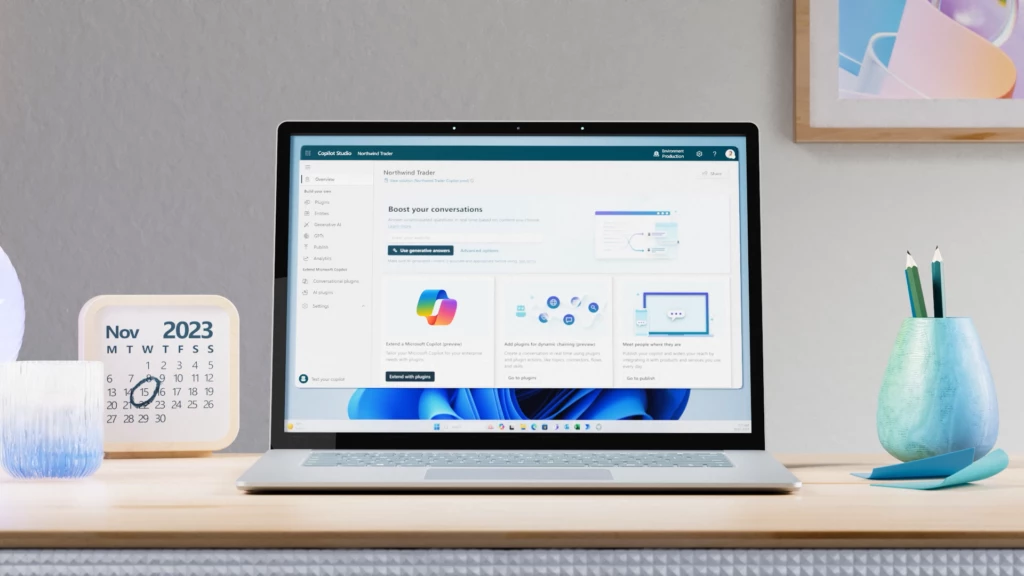
Announcing Microsoft Copilot Studio: Customize Copilot for Microsoft 365 and build your own standalone copilots
At Microsoft Ignite 2023, we’re excited to announce Microsoft Copilot Studio, a low-code tool to customize Microsoft Copilot for Microsoft 365 and build standalone copilots.
9 min read
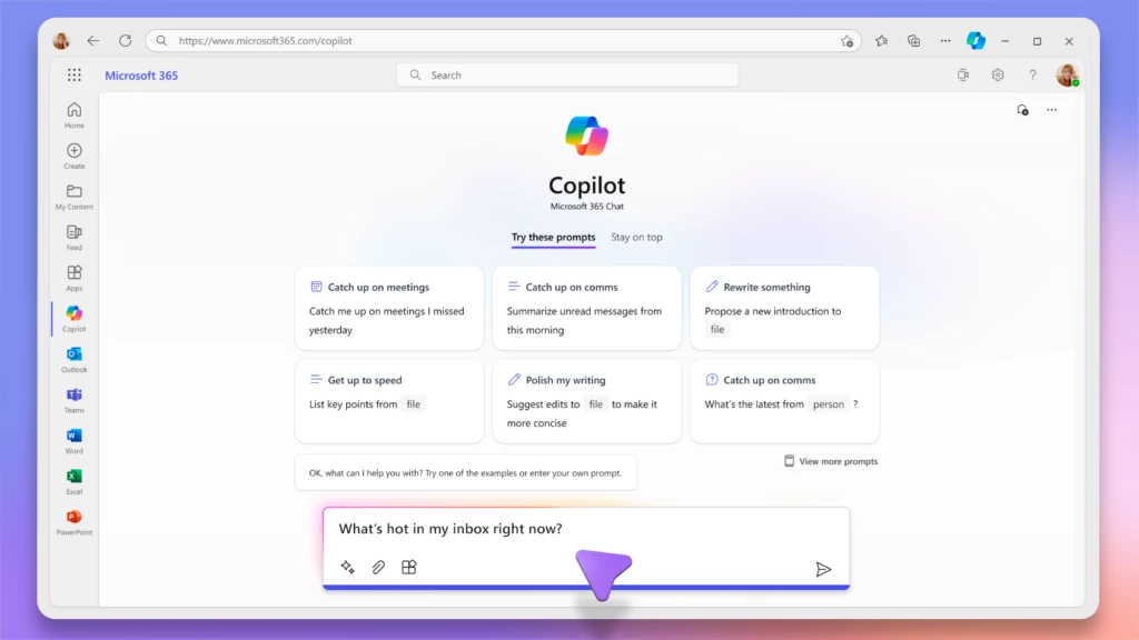
Announcing Copilot for Microsoft 365 general availability and Microsoft 365 Chat
Today at an event in New York, we announced our vision for Microsoft Copilot—a digital companion for your whole life—that will create a single Copilot user experience across Bing, Edge, Microsoft 365, and Windows.
7 min read
Microsoft Mesh enters general availability in January, including a new Teams experience
We are re-imagining the way employees come together with Microsoft Mesh, a new three-dimensional (3D) immersive experience and, we are excited to announce Mesh public preview availability in October.
Recent articles

Bringing the latest capabilities to Copilot for Microsoft 365 customers
We are announcing two important updates for users of Copilot for Microsoft 365. First, we are bringing priority access to the GPT-4 Turbo model to work with both web and work data. Second, later this month we are bringing expanded image generation capabilities in Microsoft Designer.
Your new way of working: Copilot for Microsoft 365
Small and medium-sized businesses (SMBs) have tremendous vision and passion, and Copilot for Microsoft 365 can help turn dreams into reality. With Copilot for Microsoft 365, you can use the power of AI to reduce the daily grind of running your business—giving you additional time to reach more customers, create new products, and continue to grow your business.
AI-powered collaboration with Microsoft Teams
Microsoft Teams is where work happens, and now we’re excited to announce new Copilot in Teams enhancements that will supercharge collaboration and make hybrid meetings even better. Read on for all the details.
Advancing the new era of work with Copilot, Windows, and Surface
At a digital event for commercial customers and partners, we shared an update on how we’re empowering organizations to advance in the new era of work with Microsoft Copilot, Windows, and two new Surface devices that will start to become available in April.
AI Data Drop: The 11-by-11 Tipping Point
Since we first introduced Copilot to our earliest customers, we’ve been closely studying how people are using AI at work—what’s going well, where there are challenges, and what early behaviors can teach us about adopting and rolling out AI broadly. And we want to share what we’re learning with leaders who are looking to drive AI adoption with their own people.
Ability Summit 2024: Advancing accessibility with AI technology and innovation
Today we kick off the 14th Microsoft Ability Summit, an annual event to bring together thought leaders to discuss how we accelerate accessibility to help bridge the Disability Divide. There are three key themes to this year’s summit: Build, Imagine, and Include.
Data residency in the AI era: New capabilities to manage your data
We’re excited to announce the expansion of Microsoft’s data residency capabilities by adding content of interactions with Microsoft Copilot for Microsoft 365 to our portfolio of data residency commitments and offerings. We are expanding our product terms and Microsoft 365 data residency offerings to contractually guarantee that we will store the content of your interactions with Copilot for Microsoft 365 in the same country or region in which you store your existing Microsoft 365 content.
Making our generative AI products safer for consumers
Over the past year, generative AI has seen tremendous growth in popularity and is increasingly being adopted by people and organizations. At Microsoft, we are deeply focused on minimizing the risks of harmful use of these technologies and are committed to keeping these tools even more reliable and safer.
Microsoft Dynamics 365 Business Central and Microsoft 365: Connect data to the tools where work is done
With Microsoft Dynamics 365 Business Central and Microsoft 365, businesses can establish a unified experience where data seamlessly connects with productivity apps including Microsoft Excel, Microsoft Outlook, and Microsoft Teams. This connectivity ensures that employees can access timely information, gain valuable insights, and collaborate directly within the tools they use daily—all without the need to switch between applications.
3 new ways the Microsoft Intune Suite offers security, simplification, and savings
The main components of the Microsoft Intune Suite are now generally available. Read about how consolidated endpoint management adds value and functionality for security teams.